Subspace
A fintech mobile app for card sharing, subscriptions, bill payments, and peer-to-peer transactions.
About the Project
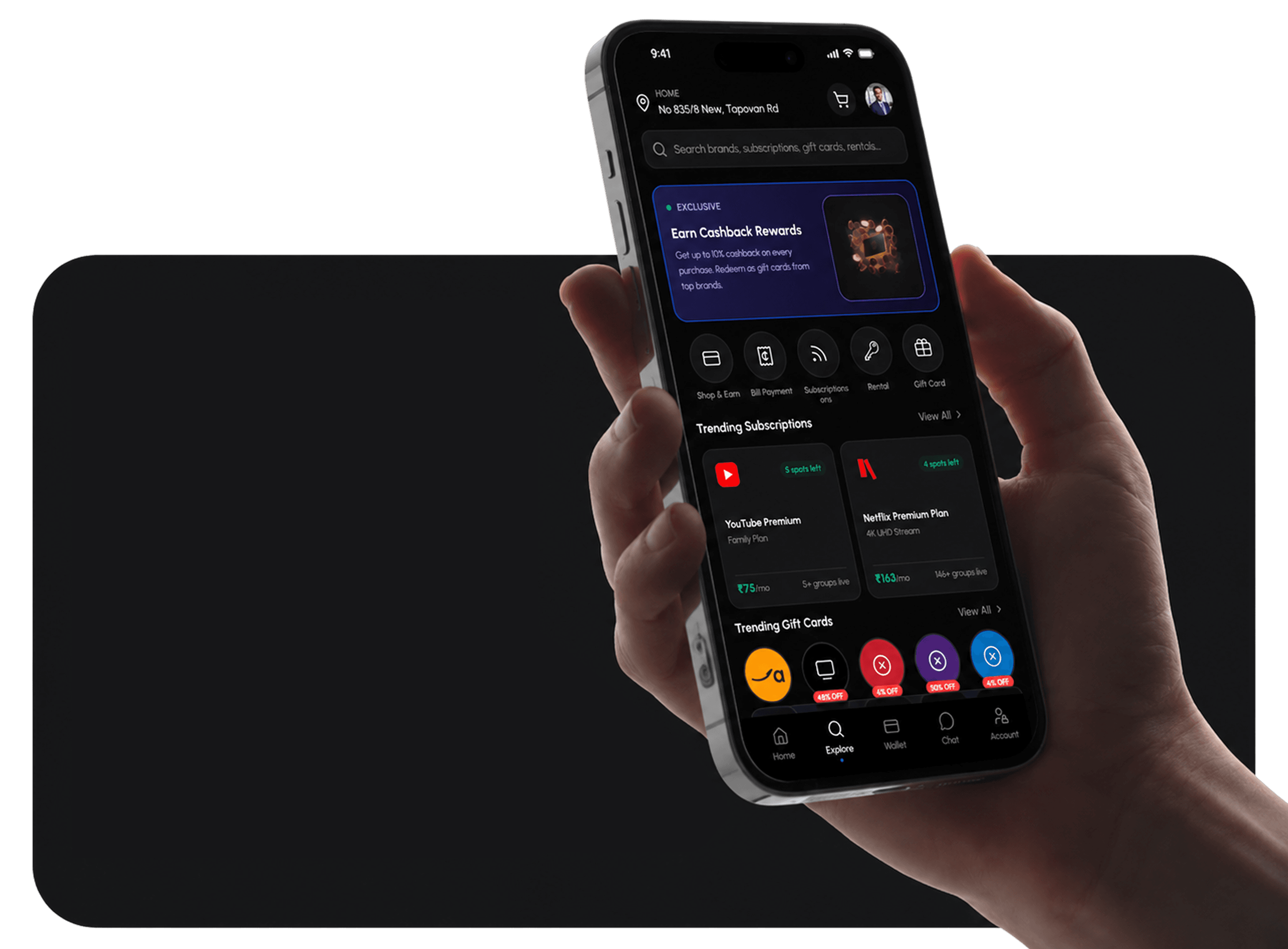
Subspace is a fintech mobile application designed to simplify how users manage shared financial services. The app consolidates card sharing, bill splitting, subscriptions, rentals, and gift cards into a single intuitive interface.
The project explored how financial tools can feel approachable and social — moving beyond traditional banking UI to create an experience that feels native to how young users actually interact with money.
Core features include a Home dashboard with financial overview, Explore page for discovering services, Wallet for card management, Chat for peer communication, and dedicated flows for Bills and Recharges, Shared Subscriptions, Rentals, Gift Cards, Shop and Earn, and Card Share.
Comparison and Rationale
A screen-by-screen breakdown of the problems in the old design and the solutions applied in the new version.
Home
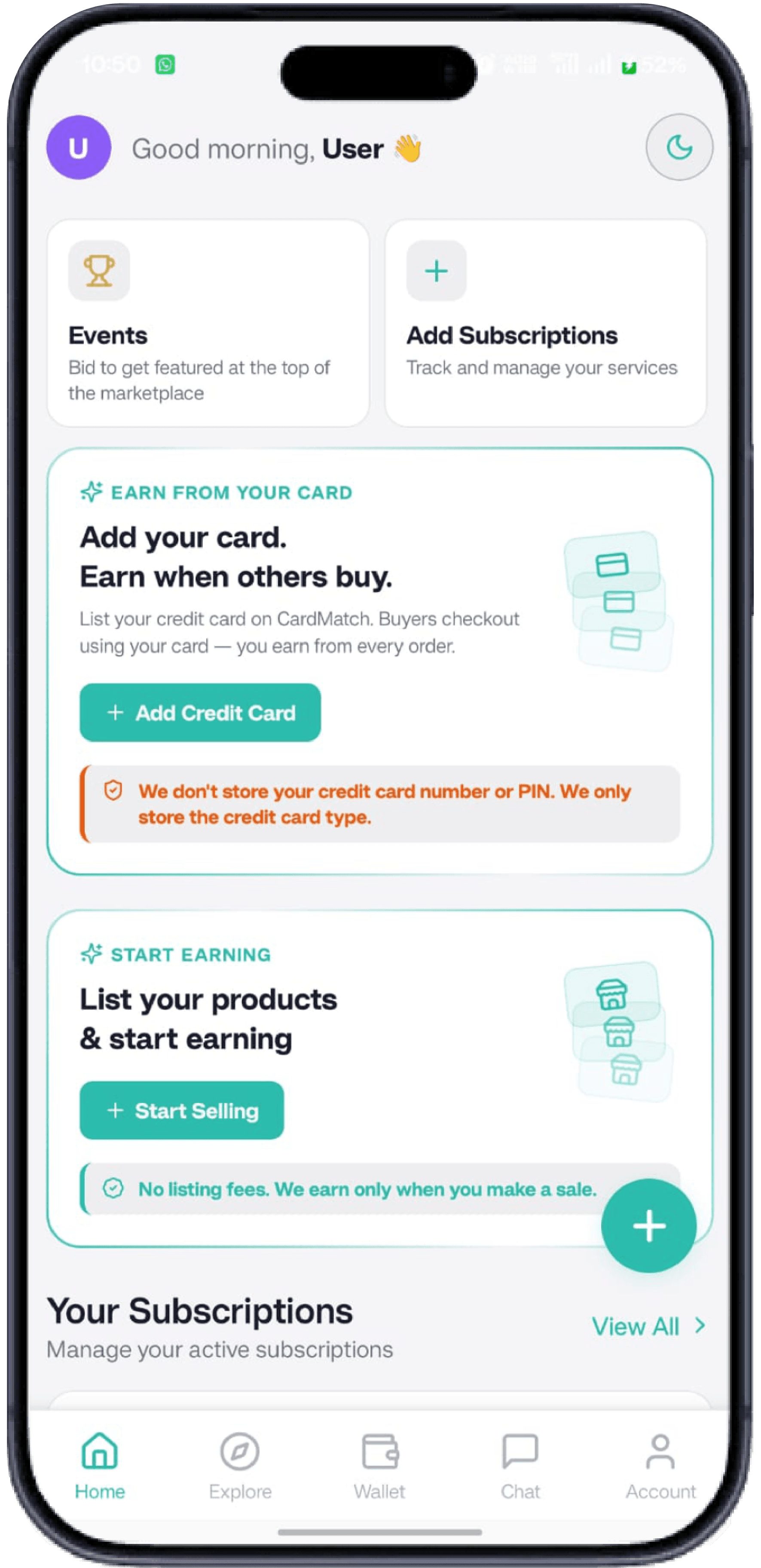
Overlapping floating button caused accidental taps.
Weak hierarchy made key actions and prices hard to find.
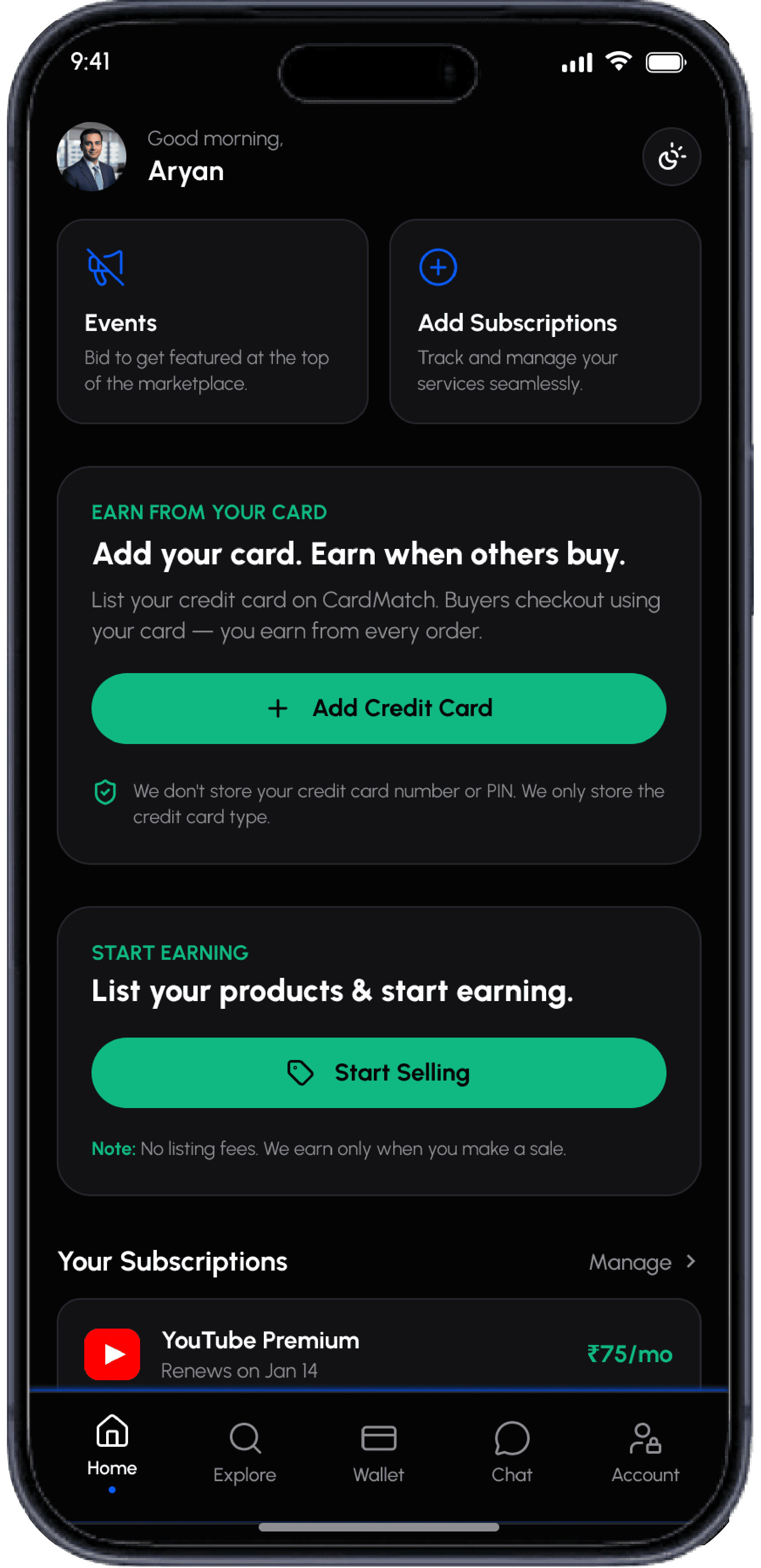
Clean, spaced cards with zero overlap.
Clear hierarchy — greeting, quick actions, banners, and subscriptions with logos and green price tags.
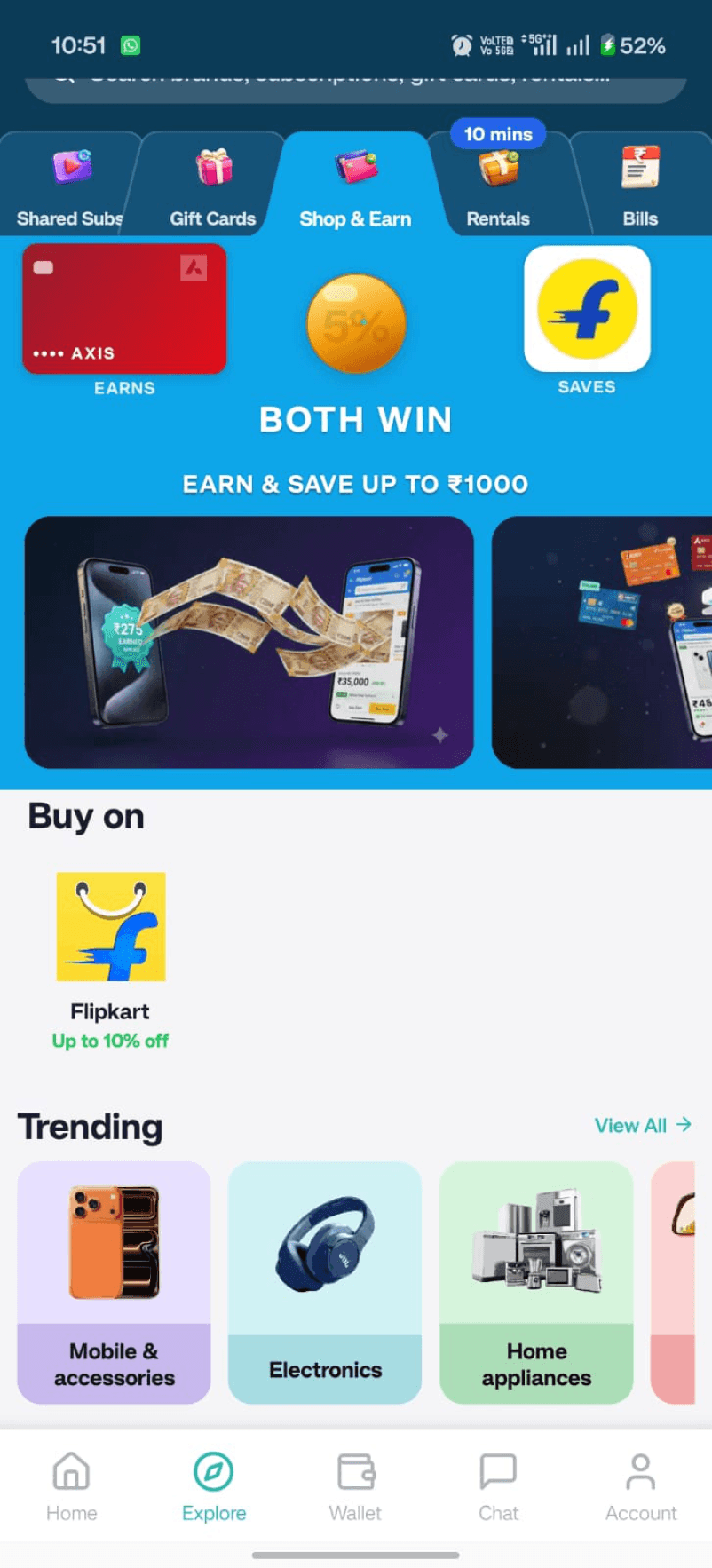
Explore
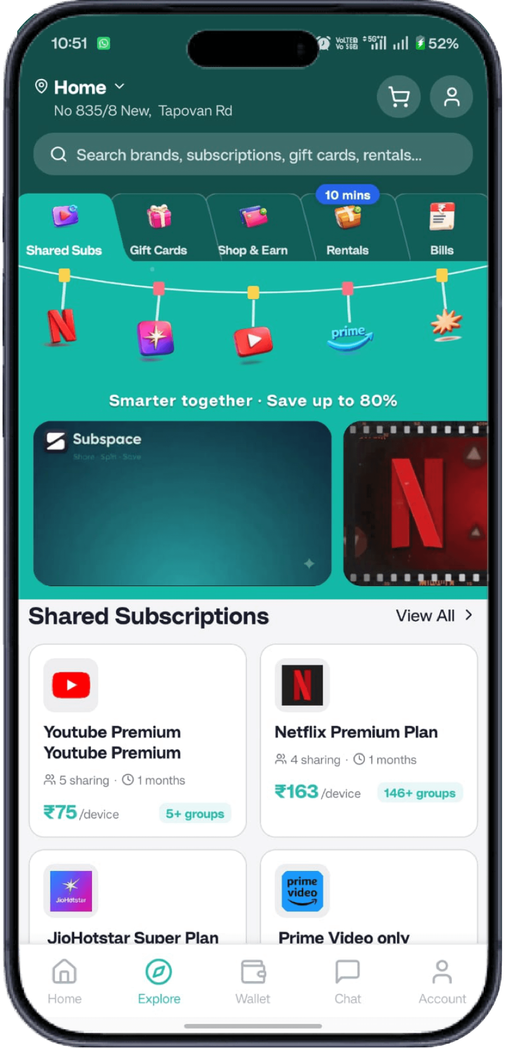
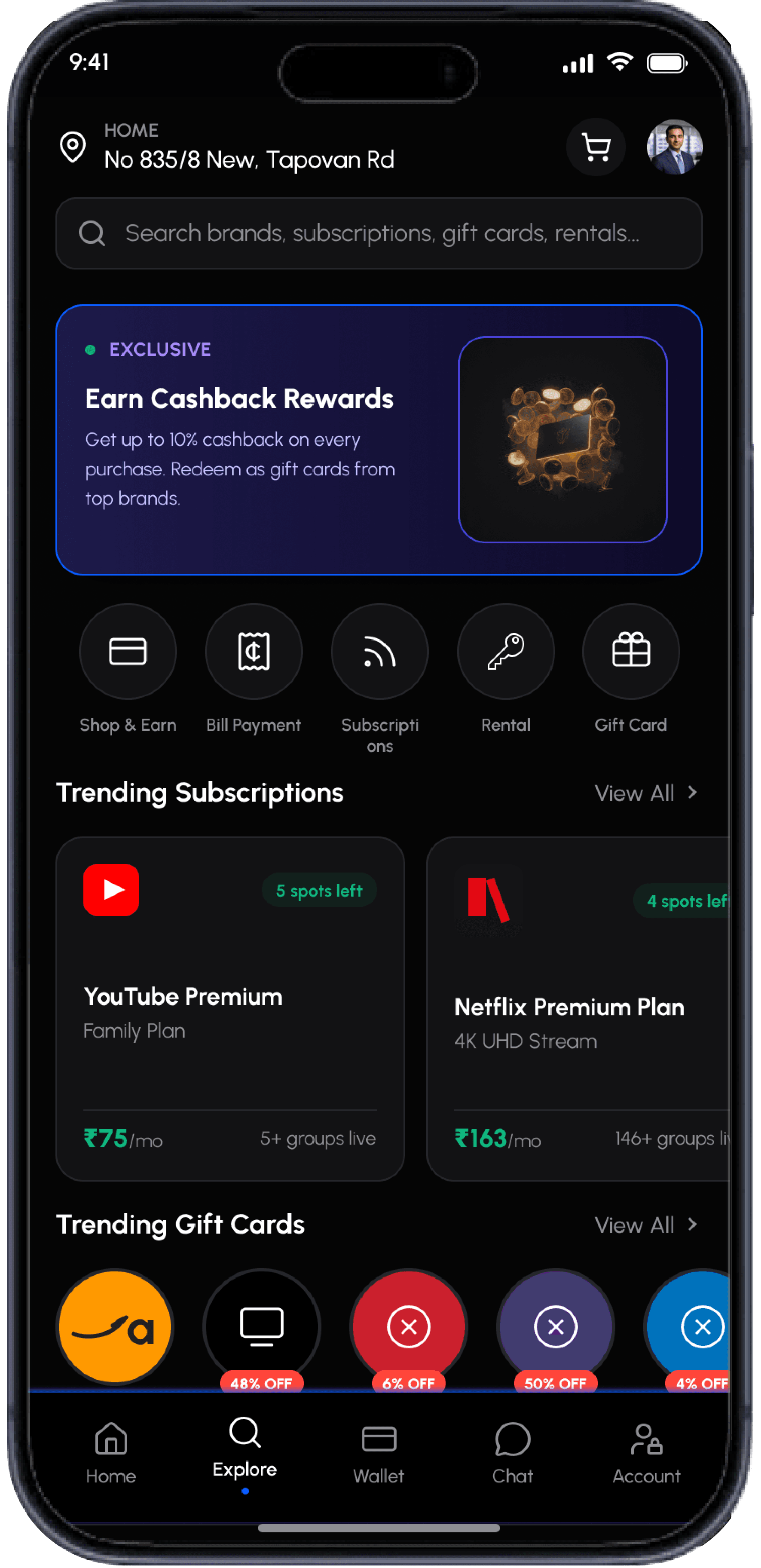
Top tabs fragmented features; many were missed.
Pastel 3D category cards created visual noise.
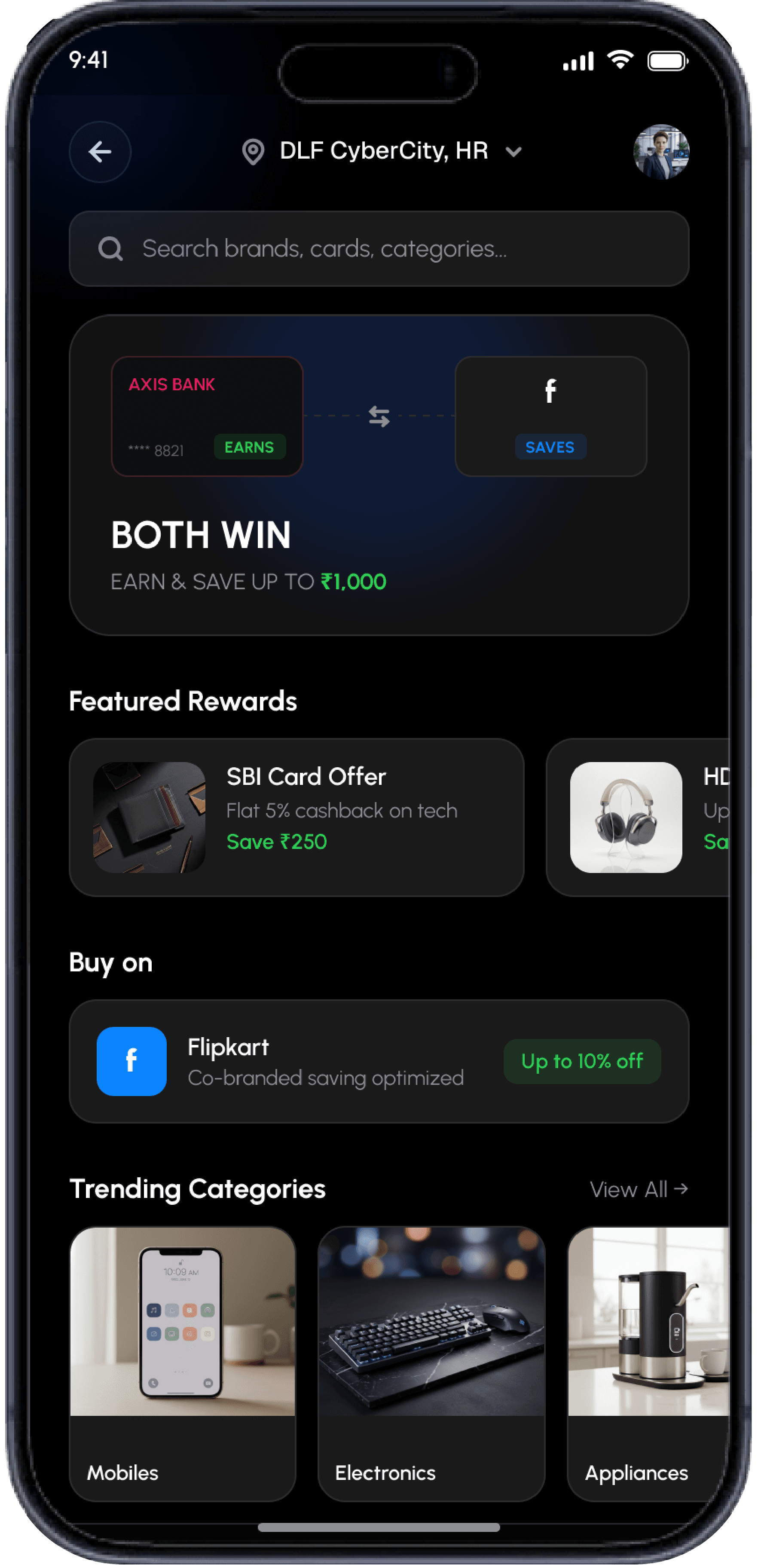
BOTH WIN hero highlights card savings clearly.
Categories redesigned as scannable dark cards with crisp product photos.
Wallet
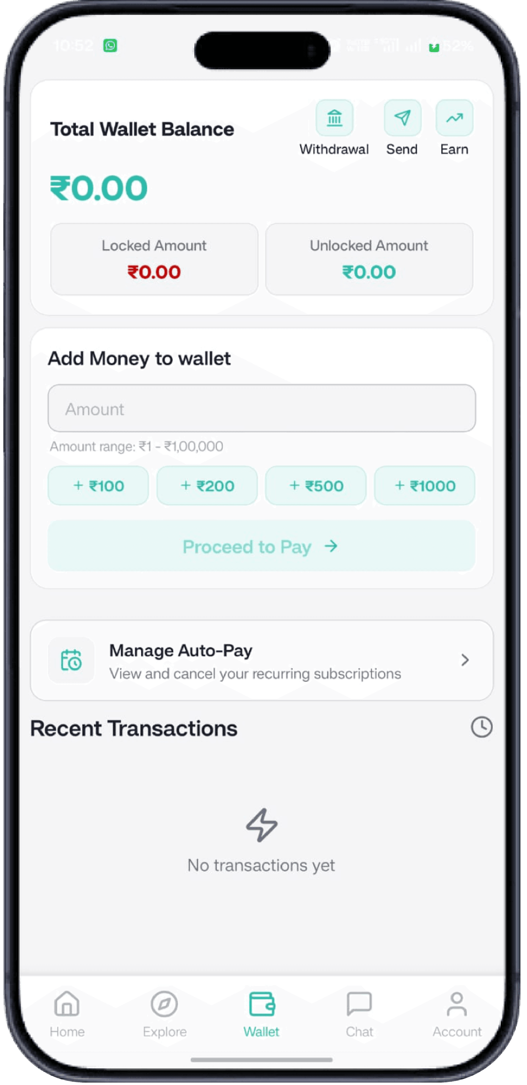
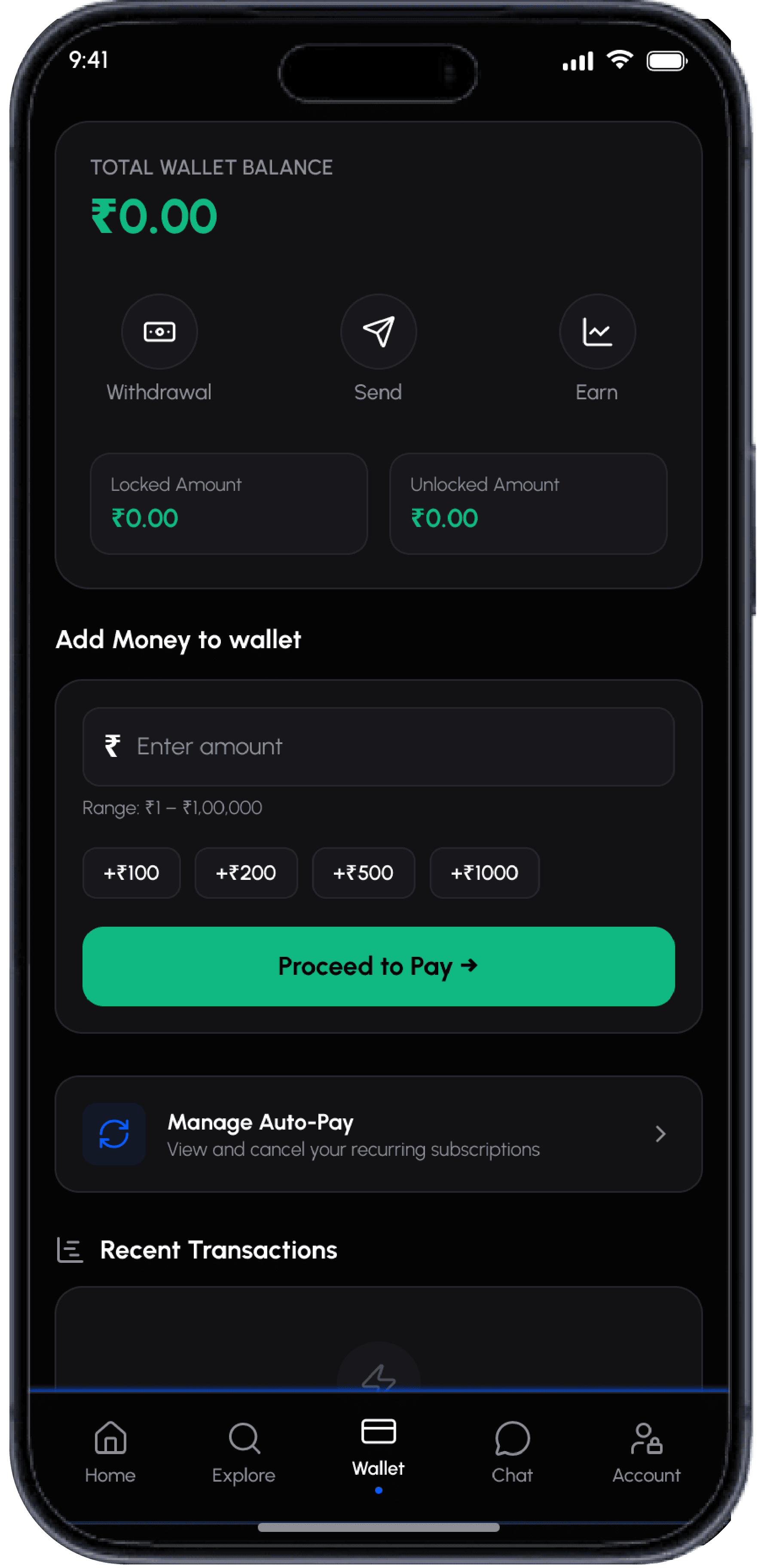
Too casual and hard to scan.
Balance on top for instant visibility.
Actions and transactions in clean, separated cards.
Chat
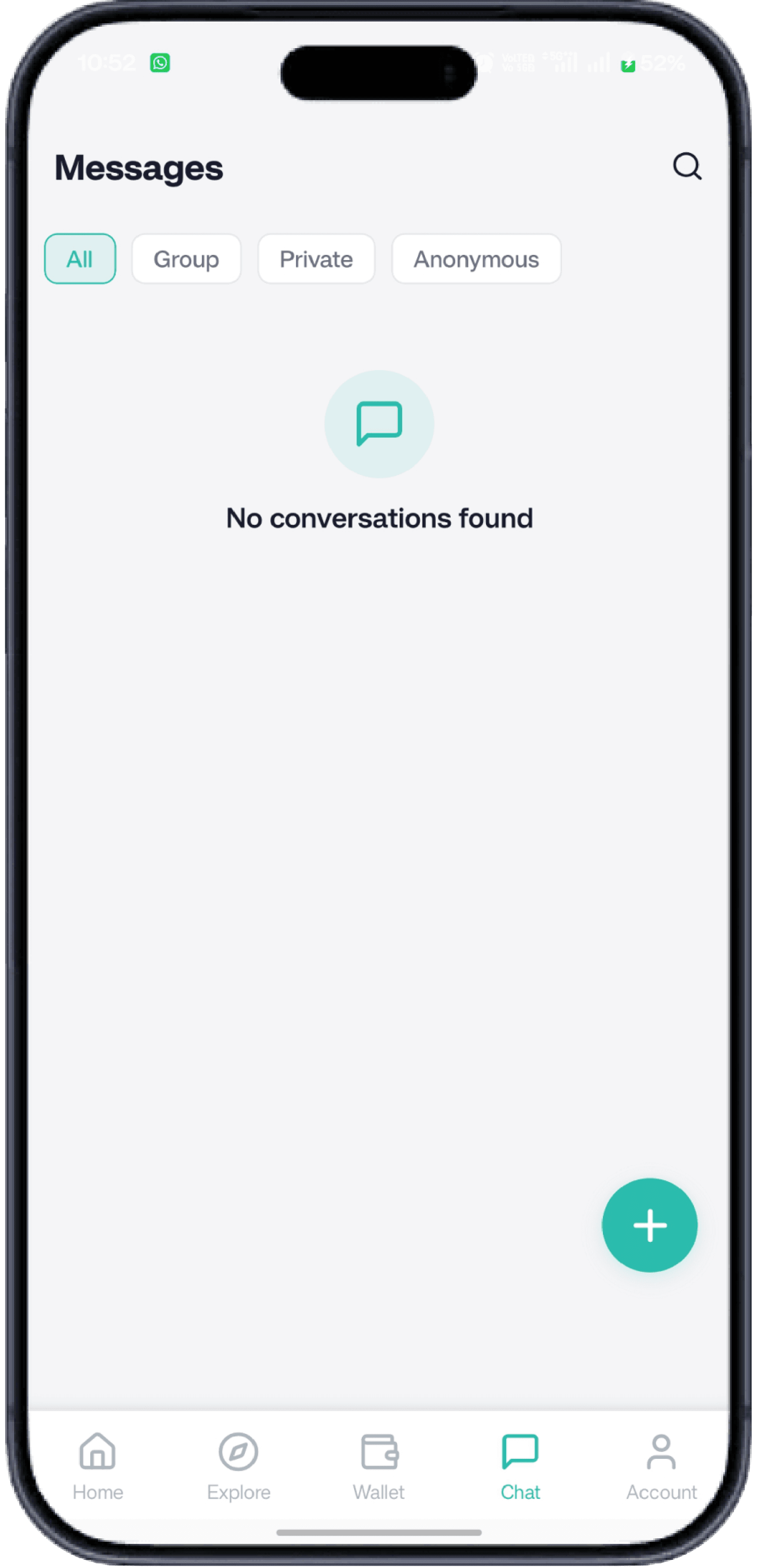
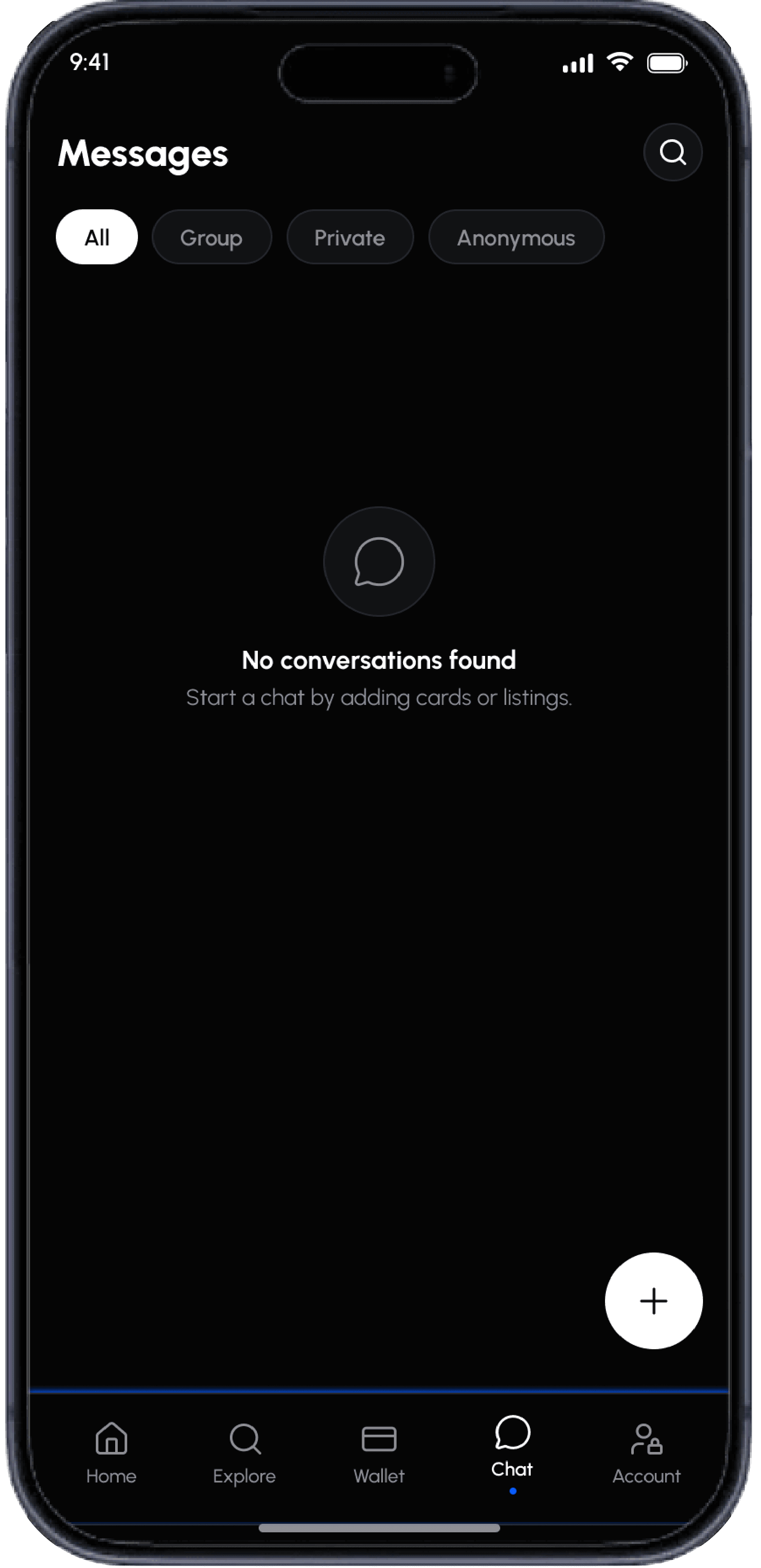
Messages looked flat and washed-out.
Dark mode makes names and messages pop.
Account
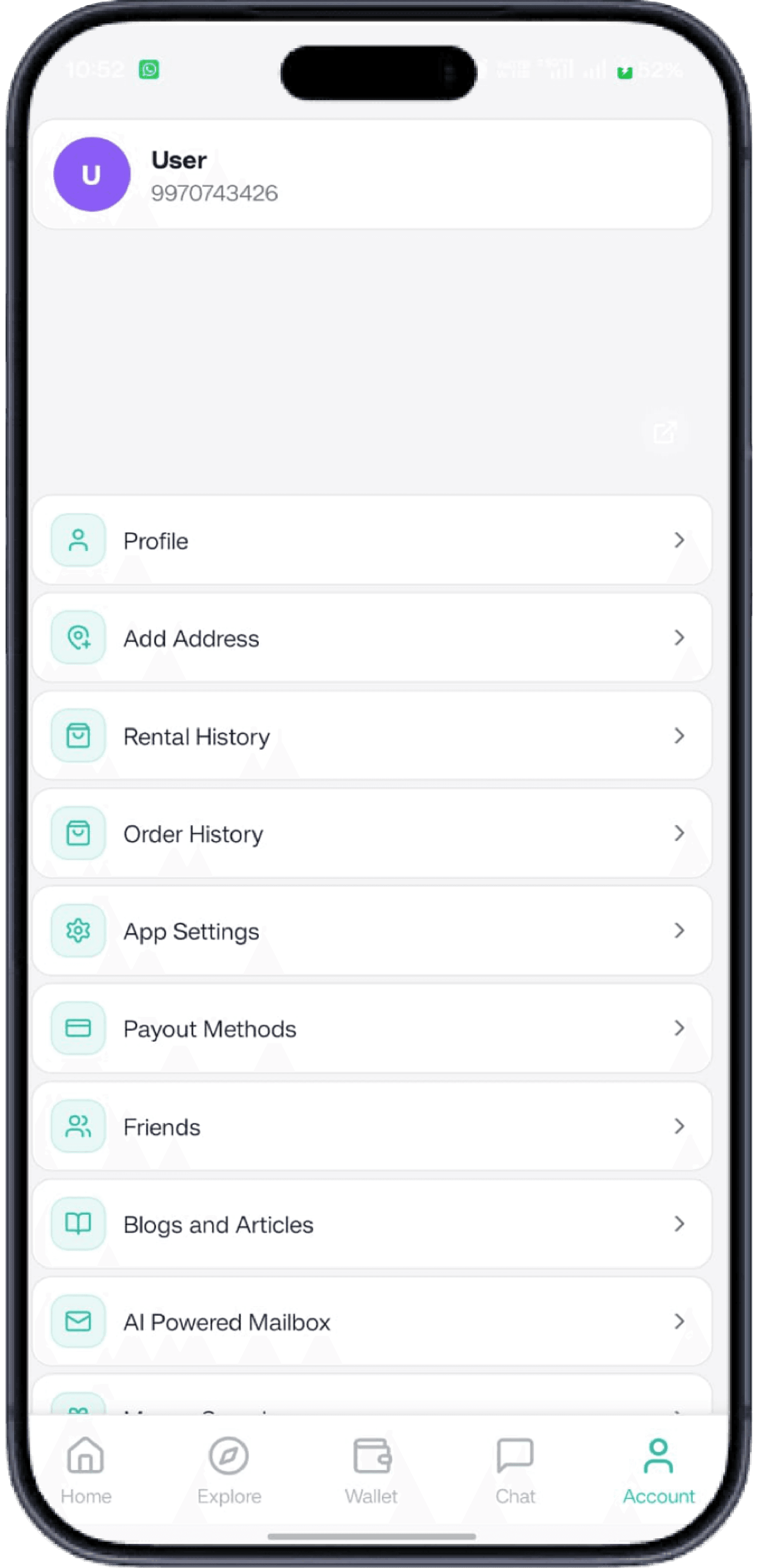
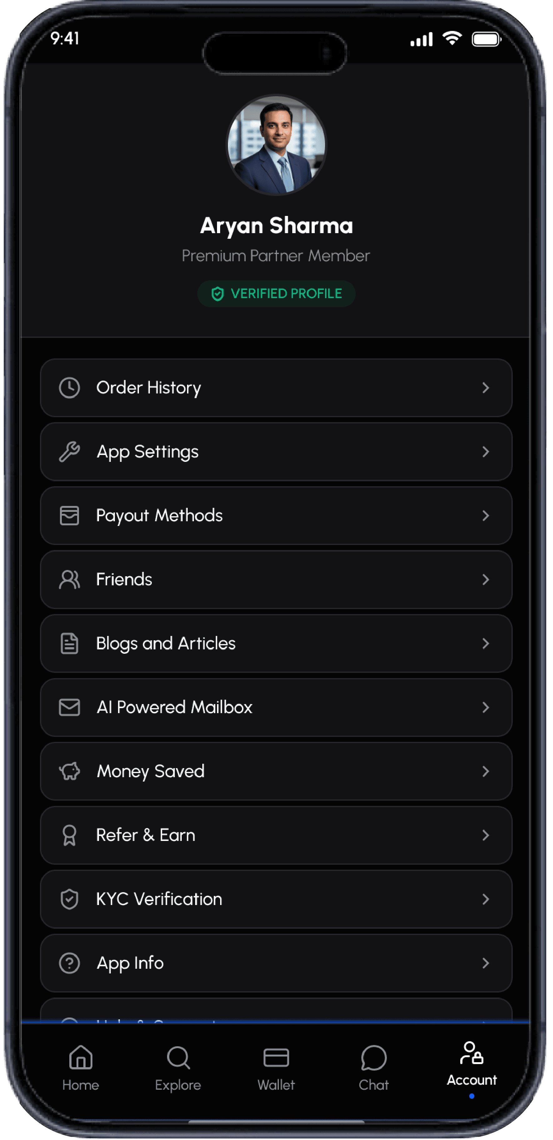
Unorganized grid felt busy and hard to use.
Bank-grade dark theme.
Settings grouped into clean, scannable cards.
Bills
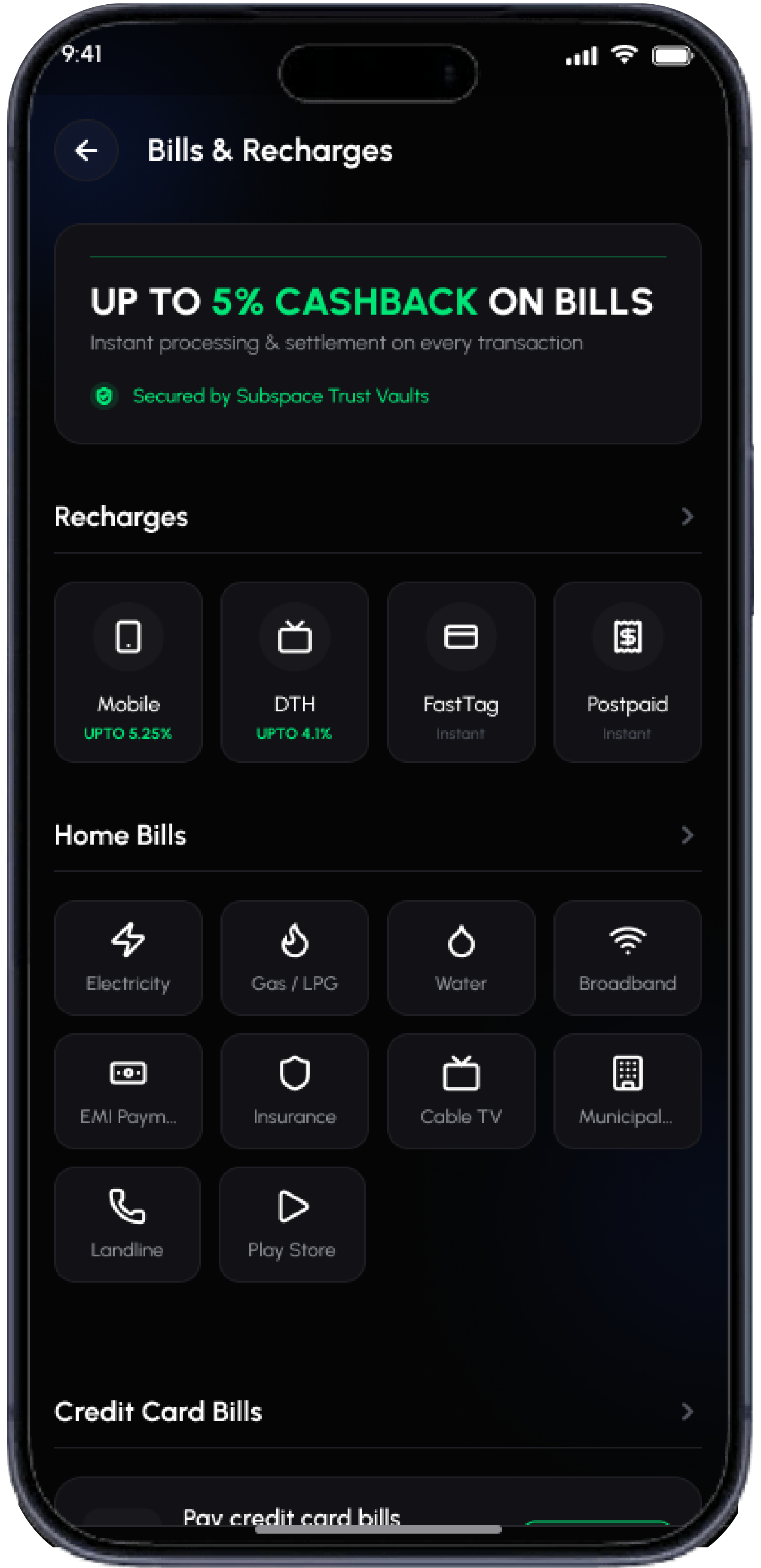
Cartoon mascots made payments feel unrefined.
Low trust and weak hierarchy.
Dark theme with clear line-art icons.
Green reserved for cashback and trust badges; tasks grouped clearly.
Gift Cards
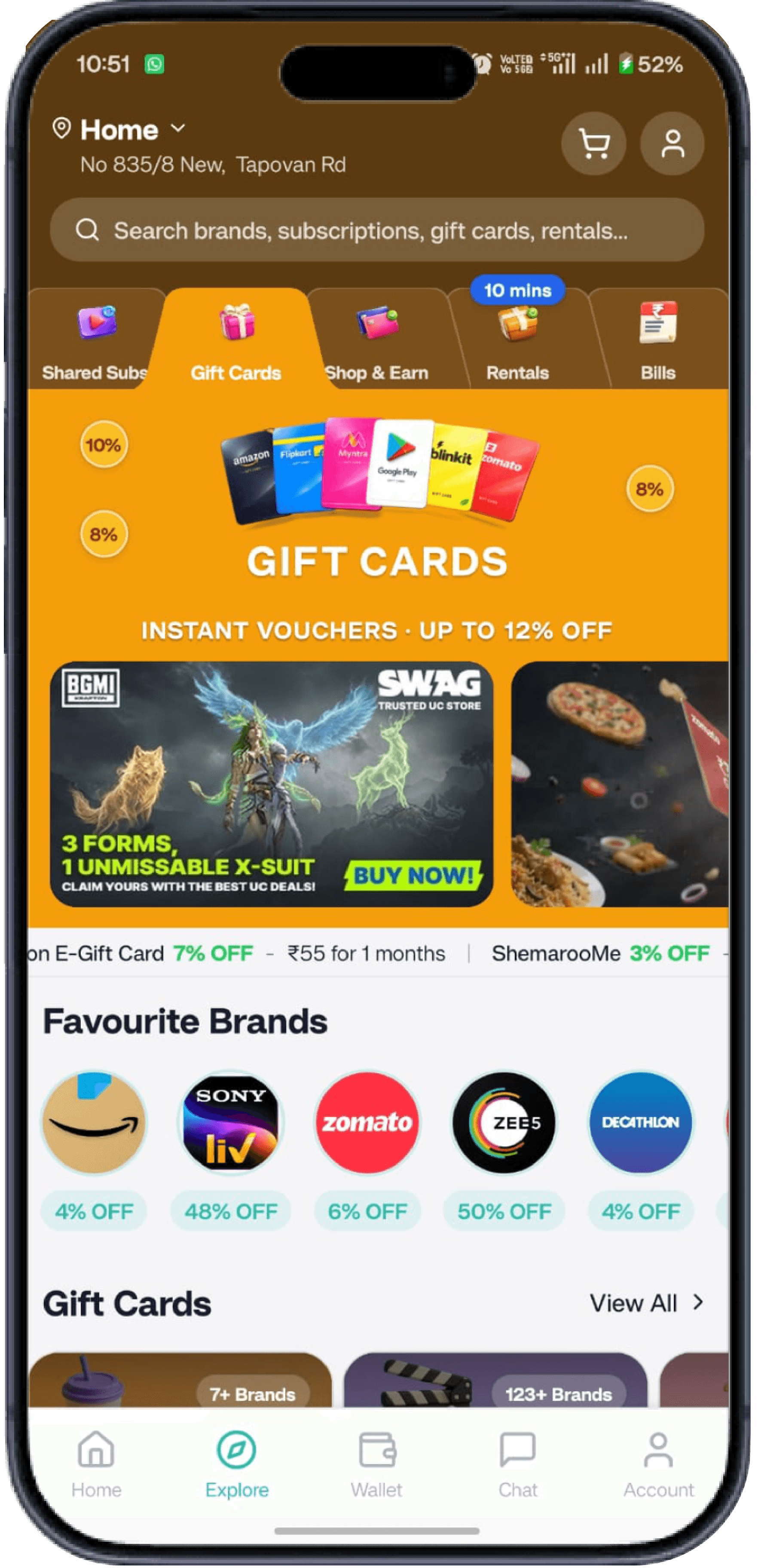
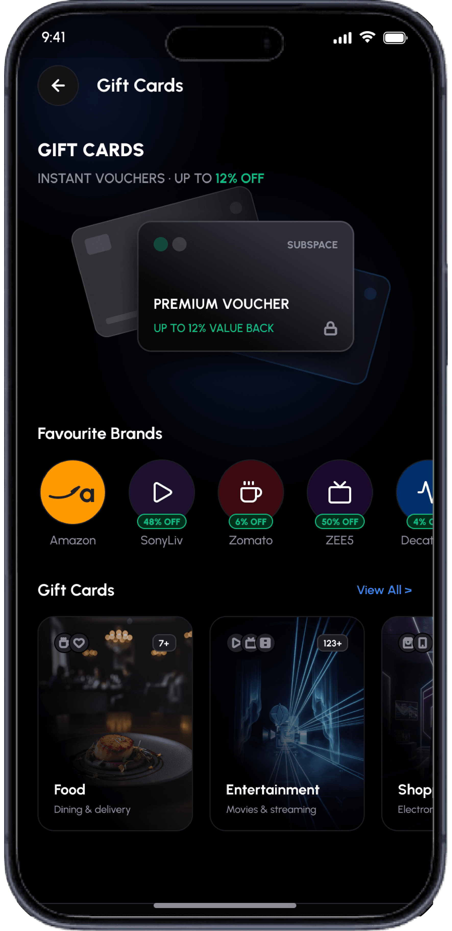
Cluttered nav; offers were hard to compare.
Dark theme, scannable offer cards, neon green badges.
Shopping split into Popular Brands, Trending Offers, Categories.
Subscriptions
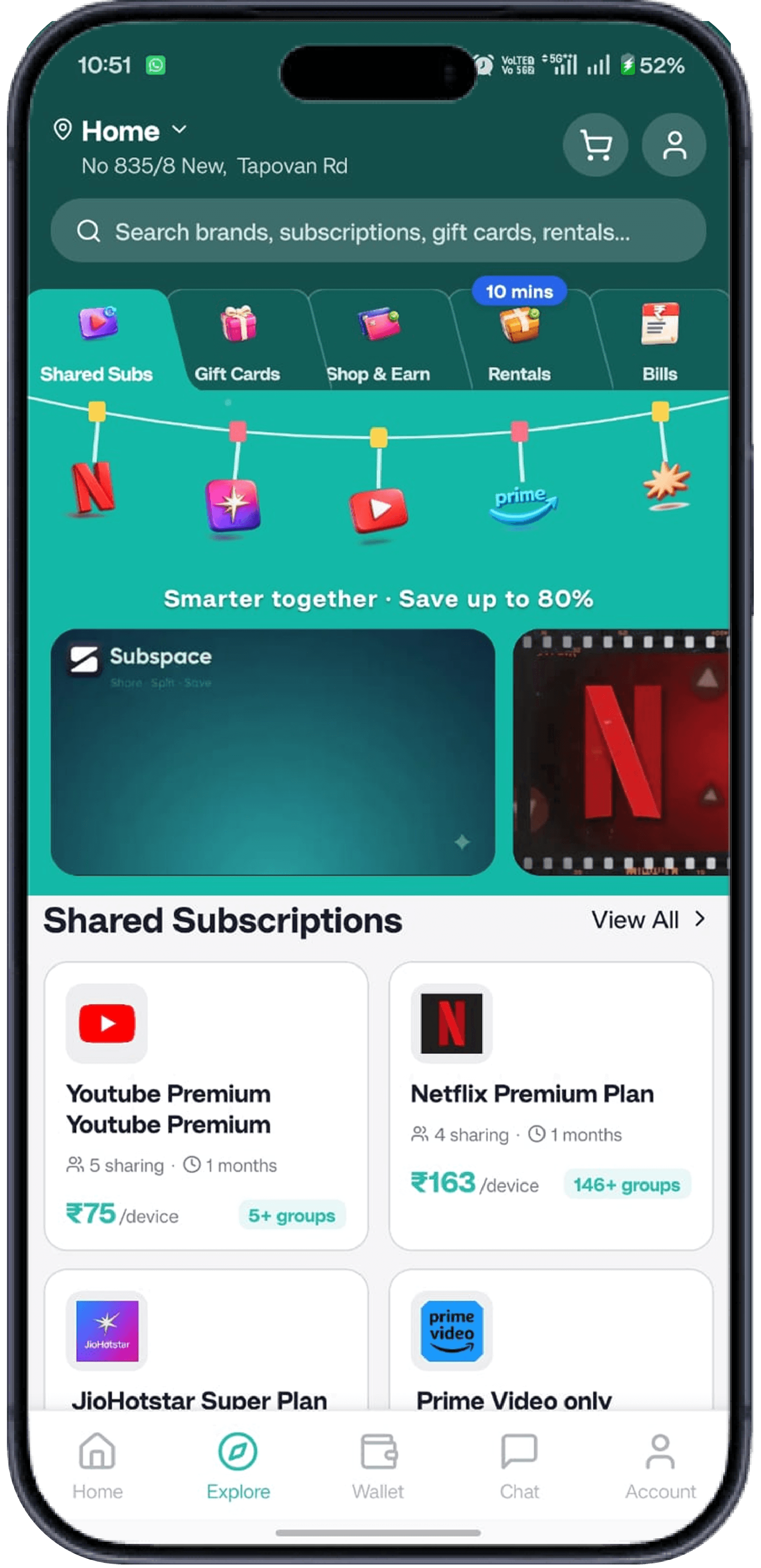
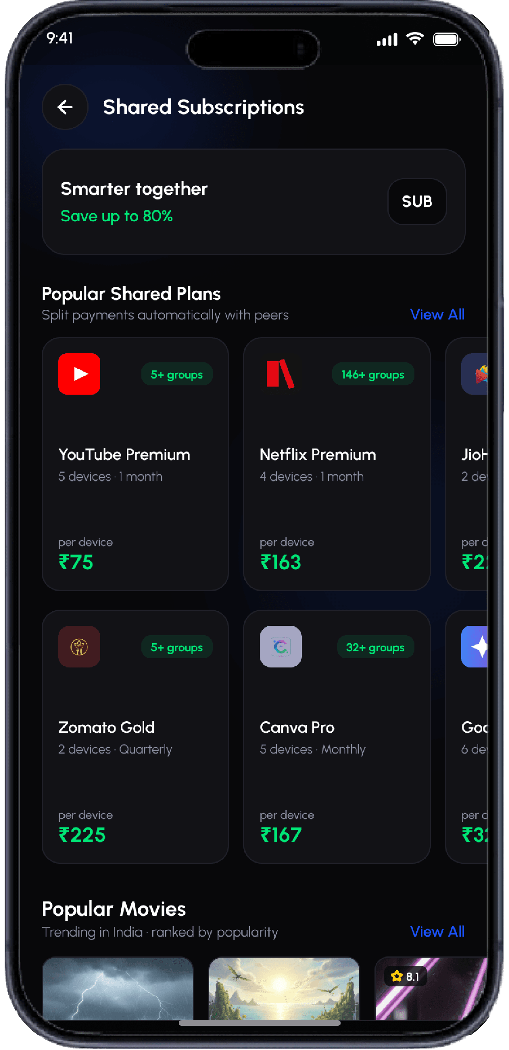
Fragmented tabs hid key features.
Plans were hard to scan.
Single vertical feed shows all plans.
Brand logos, clear pricing, and green trust badges.
Rentals
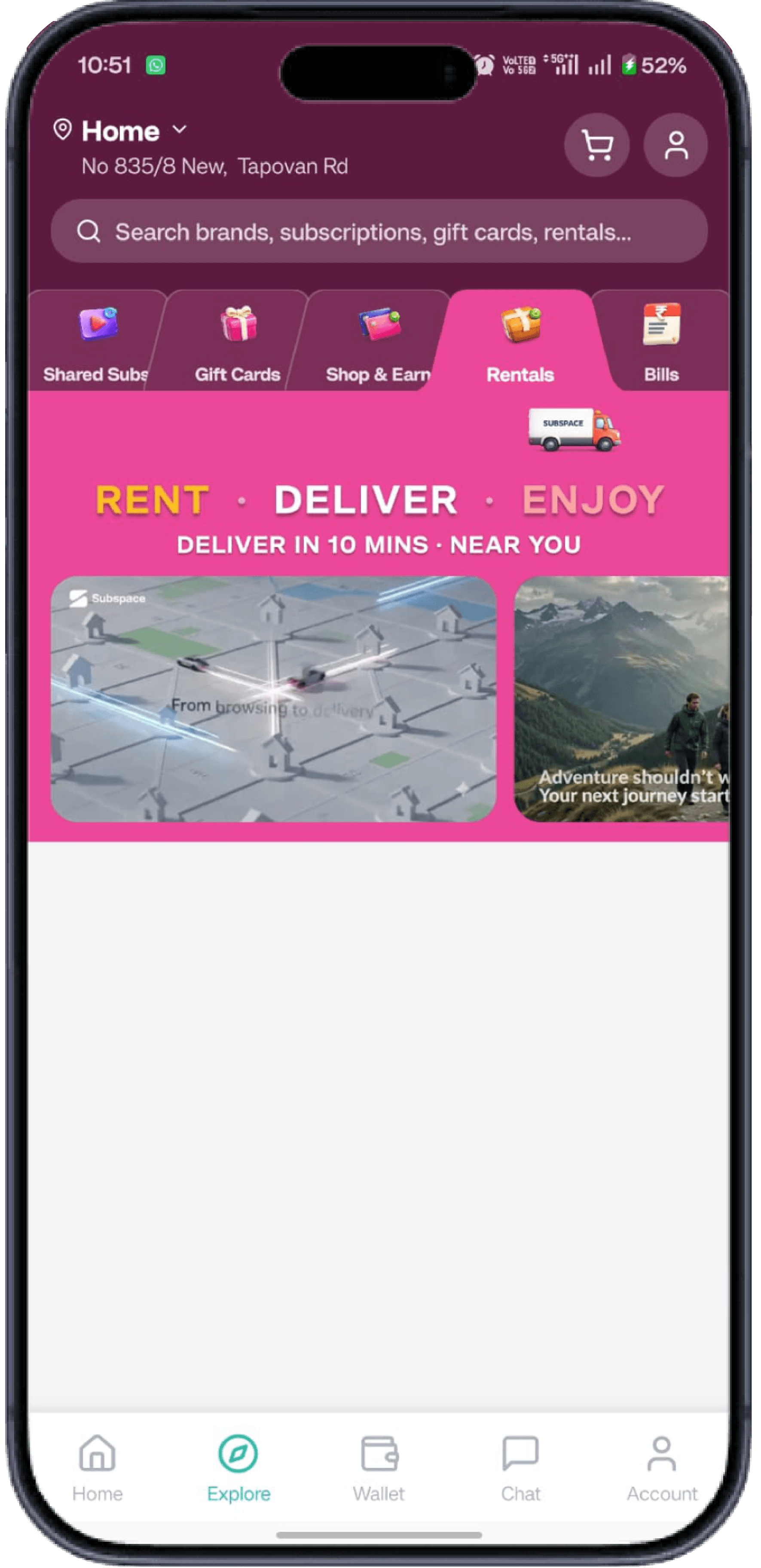
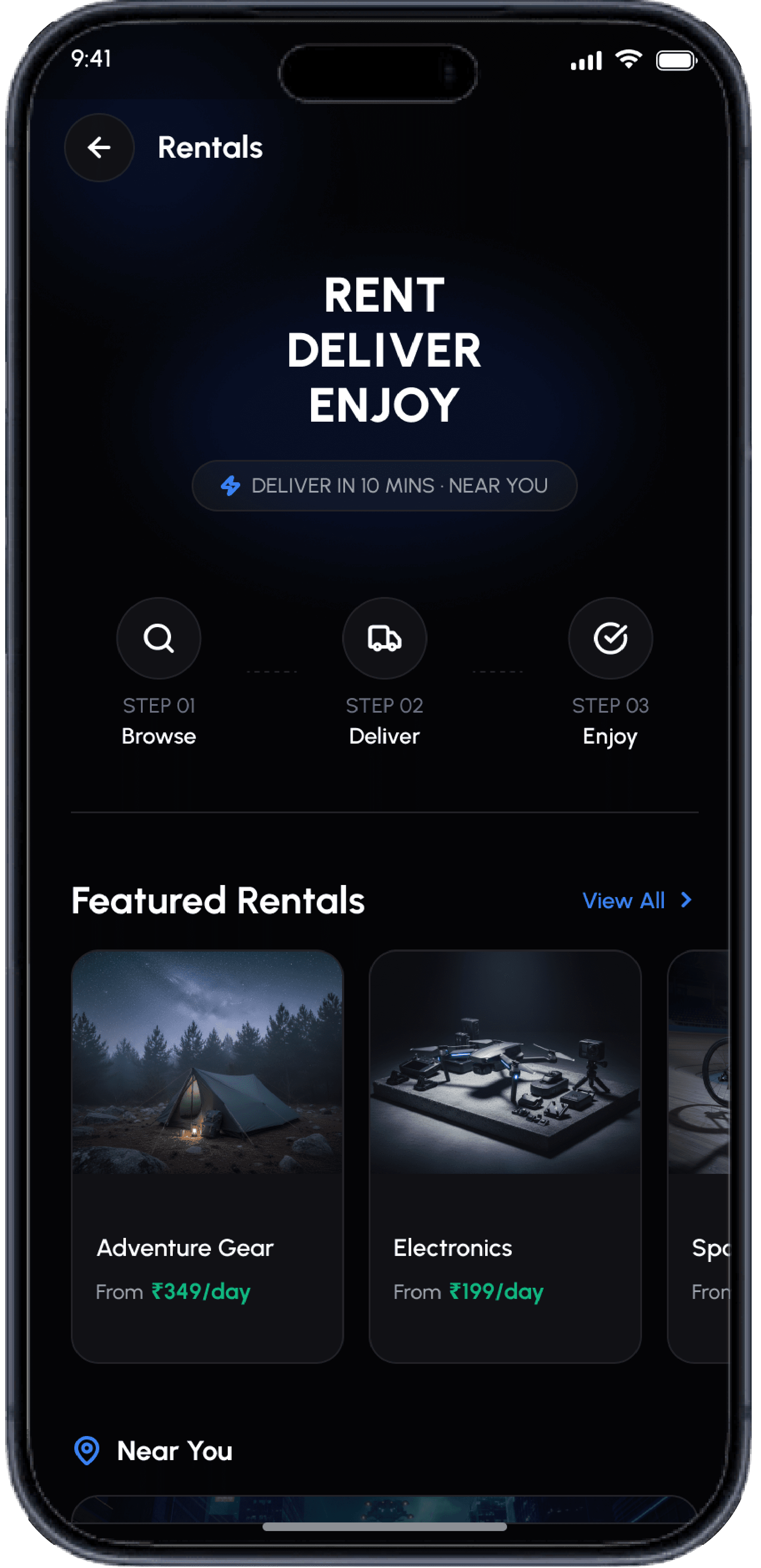
Tab and carousel fatigue; cluttered cards.
Single vertical feed.
Dedicated Rentals entry opens a focused flow.
Card Share
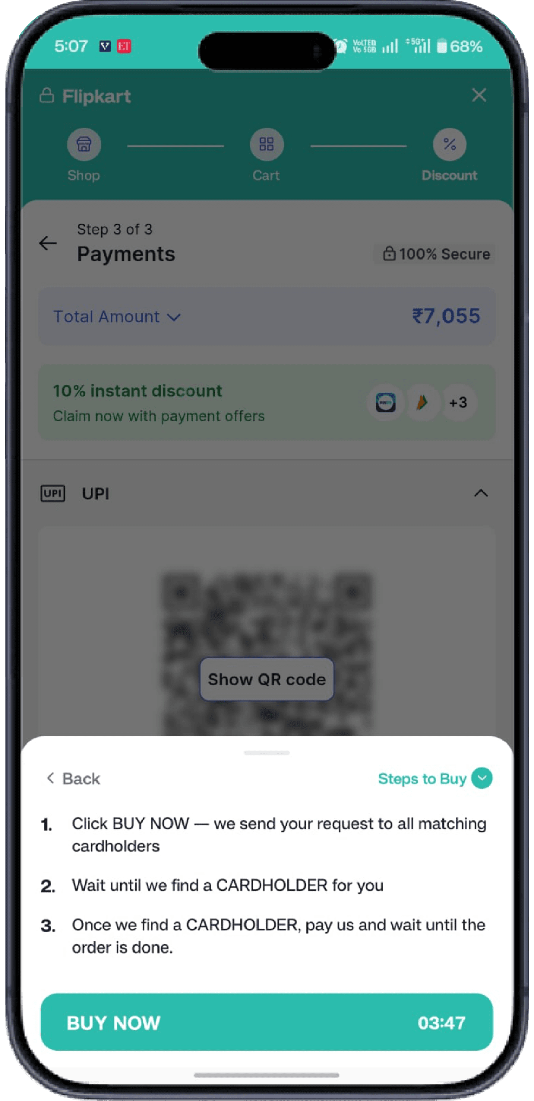
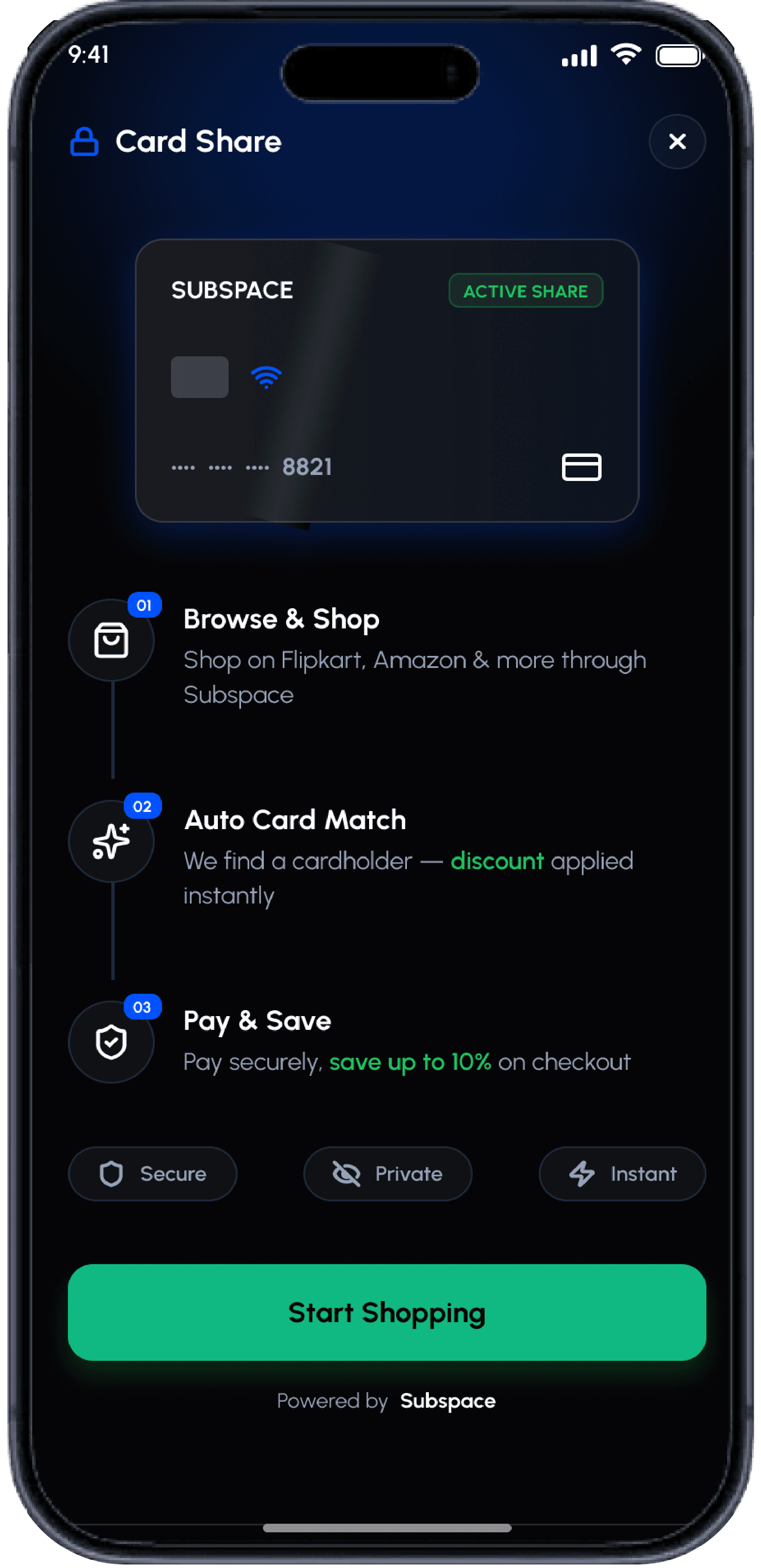
Multi-page redirects slowed checkout.
Inline bottom sheet keeps users in context.
Clear 3-step timeline and a strong primary CTA.
Buy Now
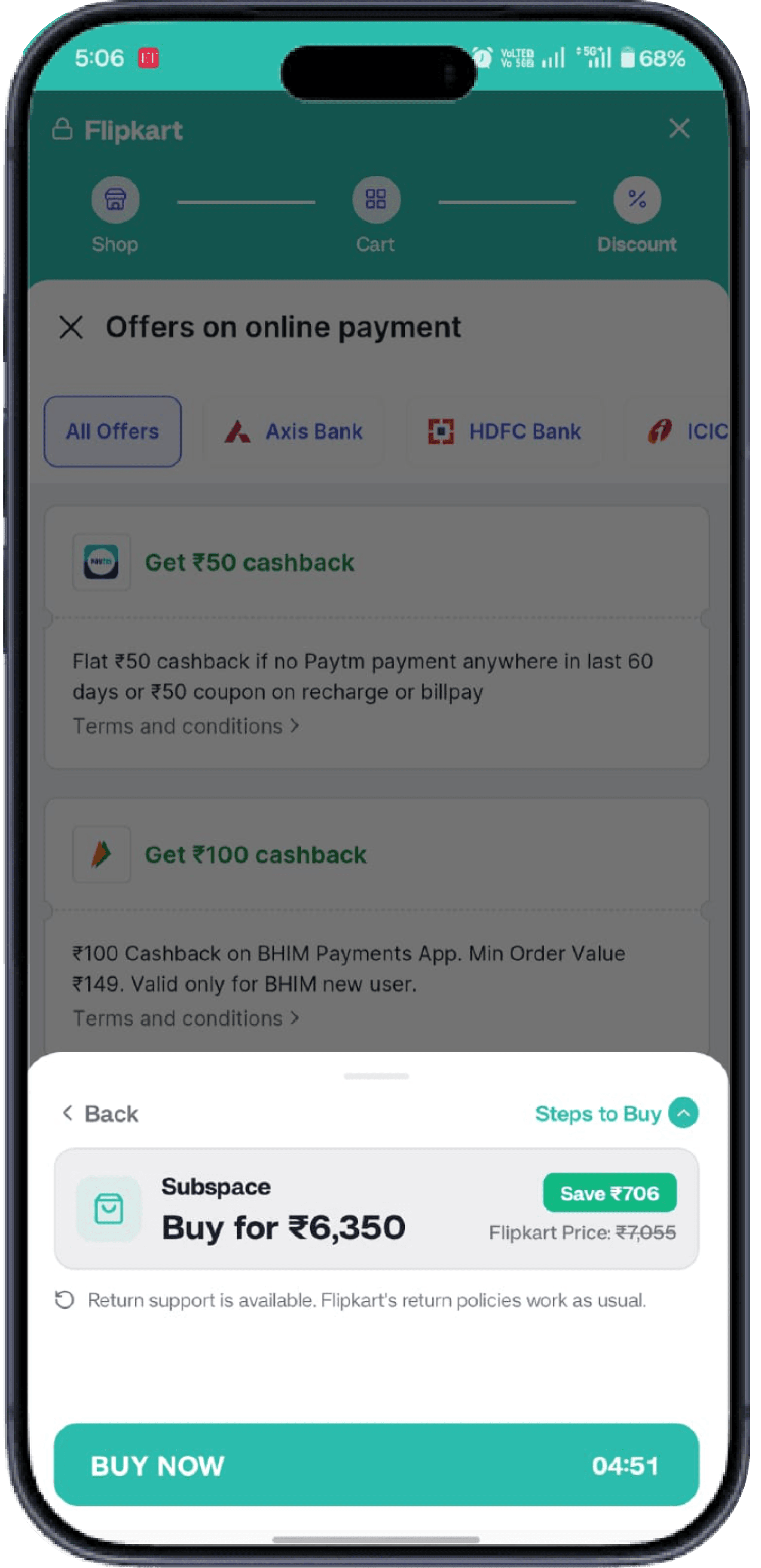
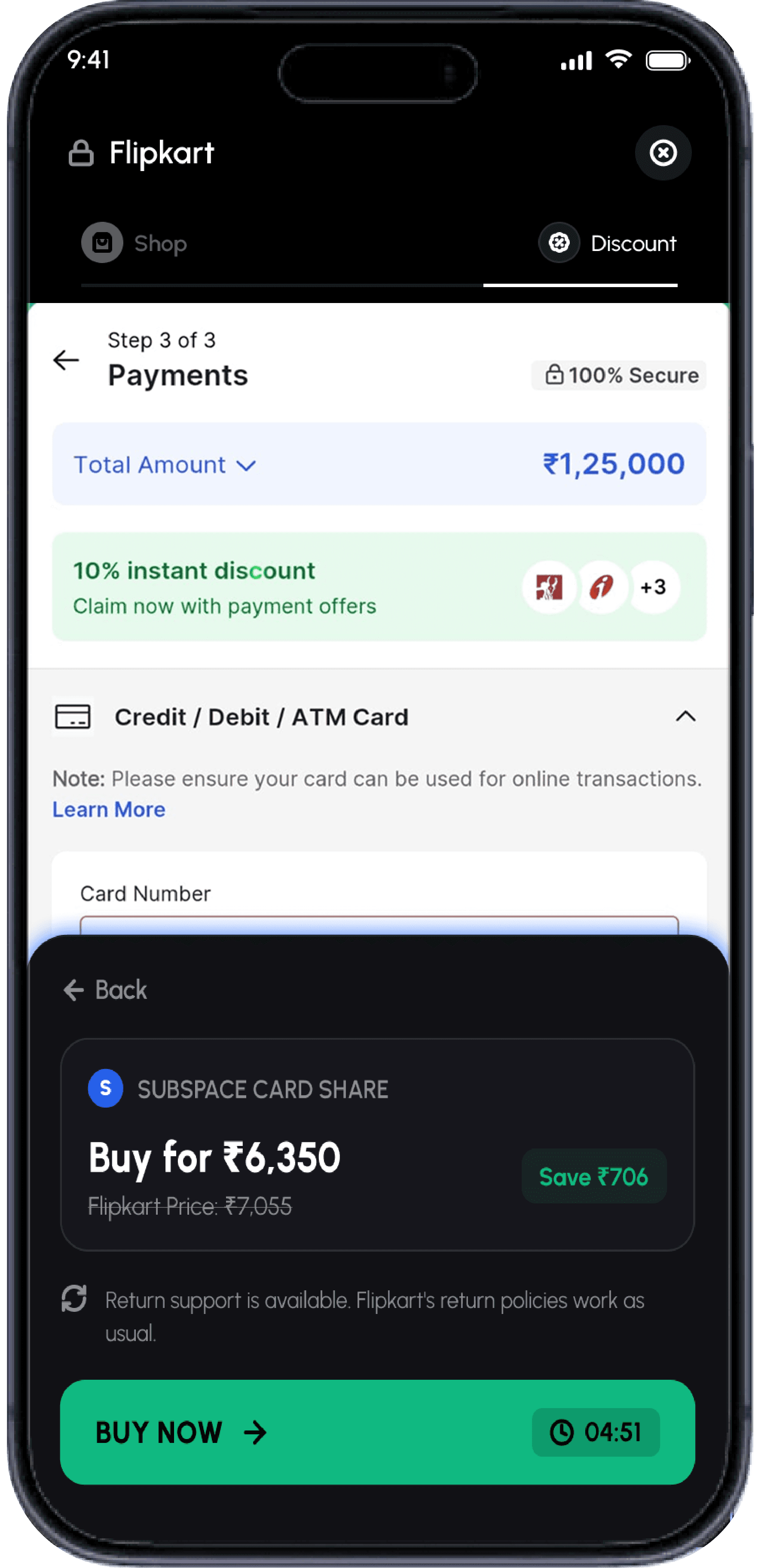
Generic, low-trust checkout; hard to go back.
One-tap bottom-sheet checkout.
Green reserved for the main action with a countdown timer.
Finding Card
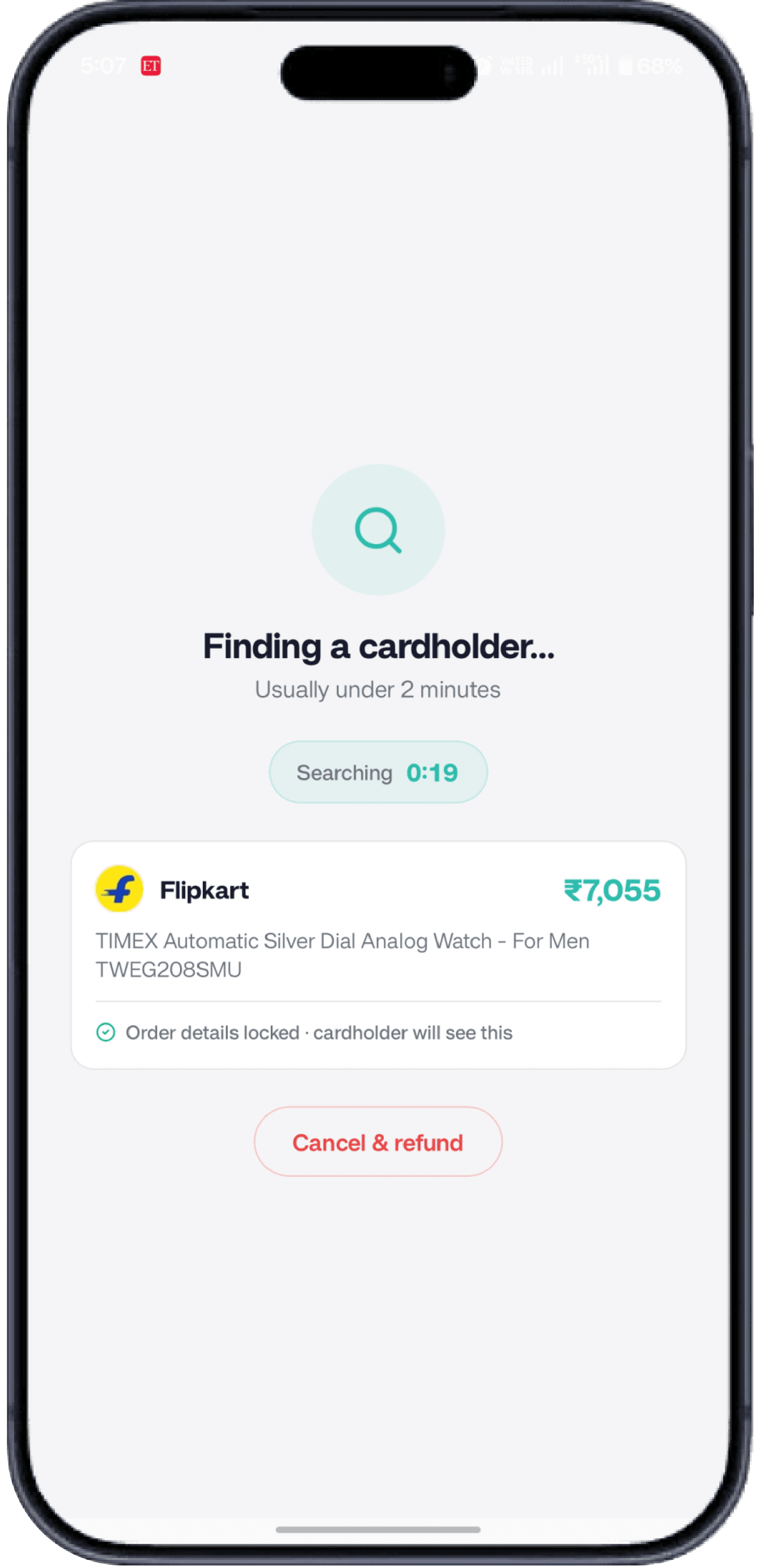
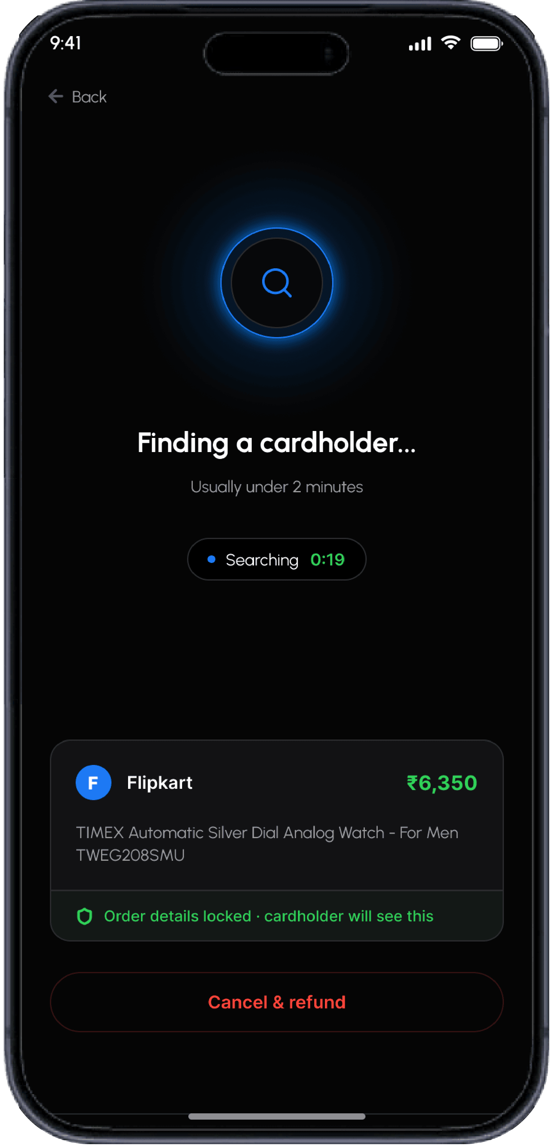
Plain, low-trust matching state.
Glowing orb shows the active connection.
Secure, Private, Instant trust cards.
Design System
Typography and color — a minimal, high-contrast system for a premium, trustworthy UI.
Typography
UrbanistFonts used in this design
Color Palette
A minimal, high-contrast palette for premium UI.
Primary Colors
Core identity — premium, clean, high-contrast foundation
Secondary / Accent Colors
Payment elements — trust and confidence
Aesthetics, modern tech-forward look
Supporting Colors
Alerts and error states
Secondary text and muted elements
Black-and-white base for a premium, trustworthy feel; green reserved for money actions and security, blue for highlights.
Core Screens
Five primary screens forming the app's navigation backbone.
Shop and Earn
Discover cashback offers, rental services, and reward programs integrated into the Explore tab.
Financial Services
Bill payments, shared subscriptions, and gift card management — all in one place.
Card Share Flow
A seamless flow for sharing payment cards with friends and family.
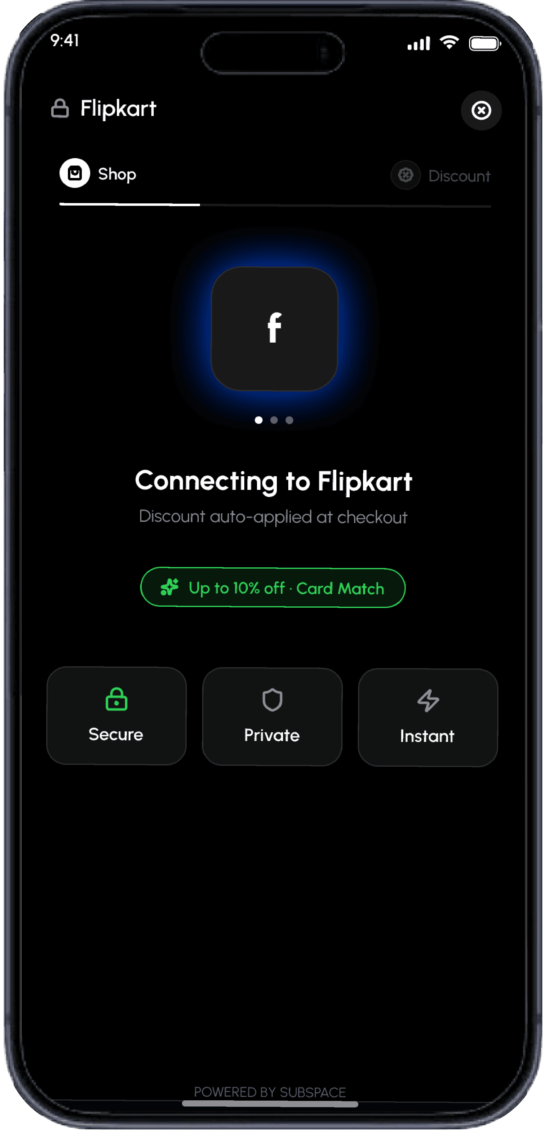
Finding Cardholder
The onboarding flow for discovering and connecting with cardholders.